
Pixel-perfect UI isn't the goal — usable, accessible, and shipped design is. Here's what the precision paradox means for SEA growth teams.
There’s a specific kind of design failure that looks immaculate in Figma and quietly haemorrhages revenue in production. No broken components, no off-brand colours — just a product so polished it forgot to be useful.
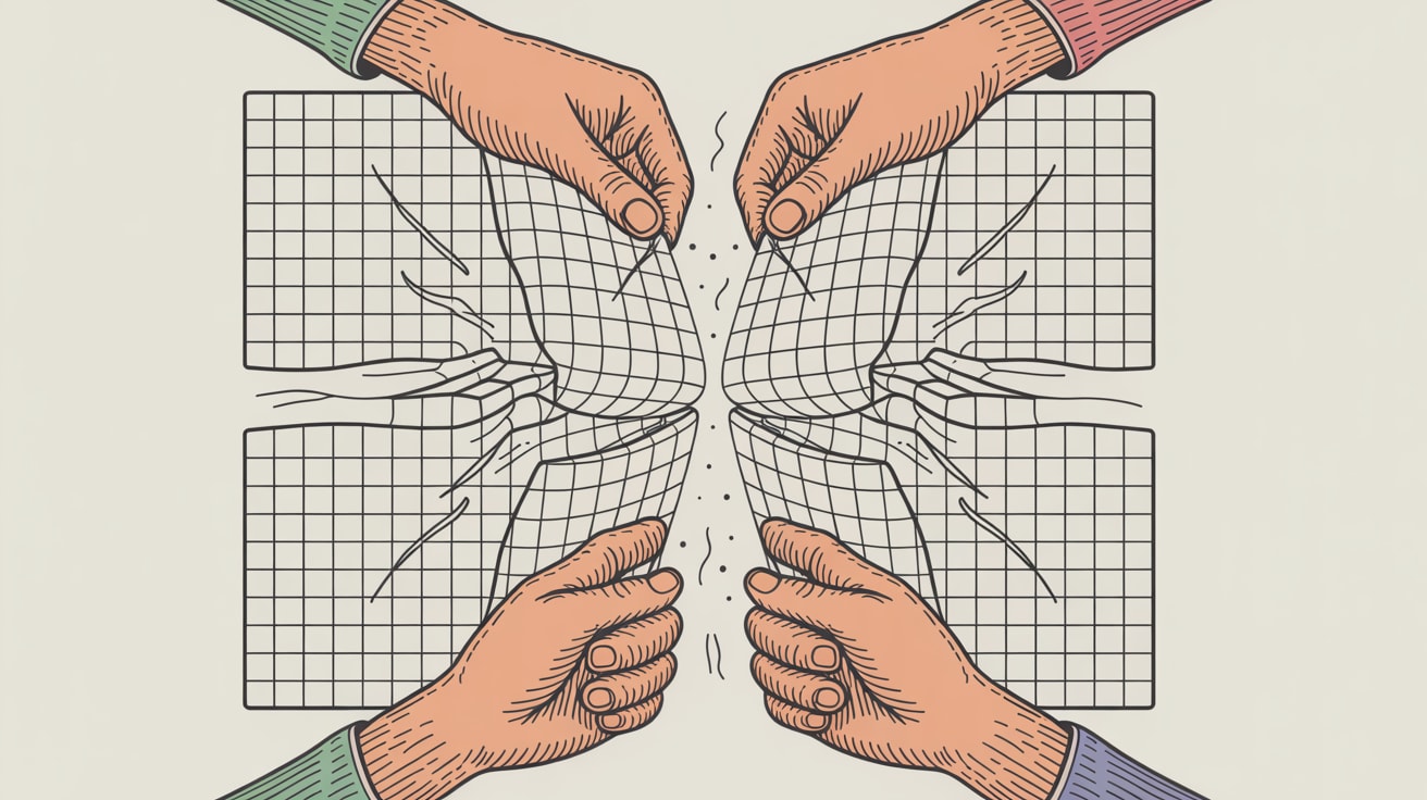
The Precision Paradox: When Perfect Is the Problem
UX Collective’s Jonathan Ng calls it the paradox of precision: the more obsessively a team pursues design perfection, the further they drift from the messy, irrational humans actually using the product. This isn’t a philosophical critique — it has a commercial footprint. When design teams spend sprint cycles debating 2px spacing adjustments or agonising over a button radius, they’re not testing whether users can actually complete a checkout flow.
For SEA markets, this failure mode is amplified. A brand optimising pixel density on a desktop layout while 78% of their Shopee or Lazada traffic arrives on mid-range Android devices isn’t making a design decision — they’re making a business mistake. Precision applied to the wrong fidelity is indistinguishable from waste. The fix isn’t less rigour; it’s redirecting rigour toward decisions that move conversion metrics rather than impress design reviewers.
Accessibility Isn’t a Compliance Checkbox — It’s a Pipeline Problem
Smashing Magazine’s Ruben Ferreira Duarte makes a point that resonates with anyone who’s built a data pipeline: accessibility works best when it’s embedded into the workflow, not bolted on at QA. His approach to font scaling in Figma uses variables to test WCAG-compliant text size increases — specifically the 200% zoom requirement — directly inside the design tool, before a single line of code is written.
The implementation is straightforward: create a Figma variable set with base and scaled font size values, then toggle between them on frames to immediately surface layout breakages. Teams catch truncated labels, overlapping components, and illegible CTAs at design stage rather than in a post-launch accessibility audit. For multilingual SEA interfaces — where Thai, Bahasa, or Vietnamese strings routinely run 30–40% longer than their English equivalents — this kind of variable-based stress testing pays for itself the first time it catches a broken navigation menu before go-live.
The broader principle: accessibility infrastructure built into design systems scales across every asset your team produces. It stops being a project and starts being a property of the pipeline.
Getting Your Team to Actually Run User Tests
Kai Wong’s piece in UX Collective tackles a problem every design lead recognises: the team knows user testing matters, but velocity pressure and stakeholder timelines consistently win the argument. His angle — applying behavioural science to internal persuasion — is practical rather than theoretical.
The most actionable framing he offers is loss aversion. Teams respond more strongly to “we’re about to ship something we haven’t tested with users” than to “we should test this to make it better.” Reframe the cost of skipping research as a concrete risk: one round of five user interviews before a checkout redesign costs roughly two days; a post-launch conversion drop of even 3% on a mid-size SEA e-commerce platform costs multiples of that every week. Presenting that trade-off with actual numbers — pulled from your analytics stack — changes the conversation from philosophical to financial.
The implementation detail matters here: keep a standing pool of recruited test participants rather than sourcing fresh respondents for every sprint. Brands running growth programmes on Grab or LINE often have CRM segments they can tap for rapid feedback. Reducing the friction of starting a test is what actually gets tests run.
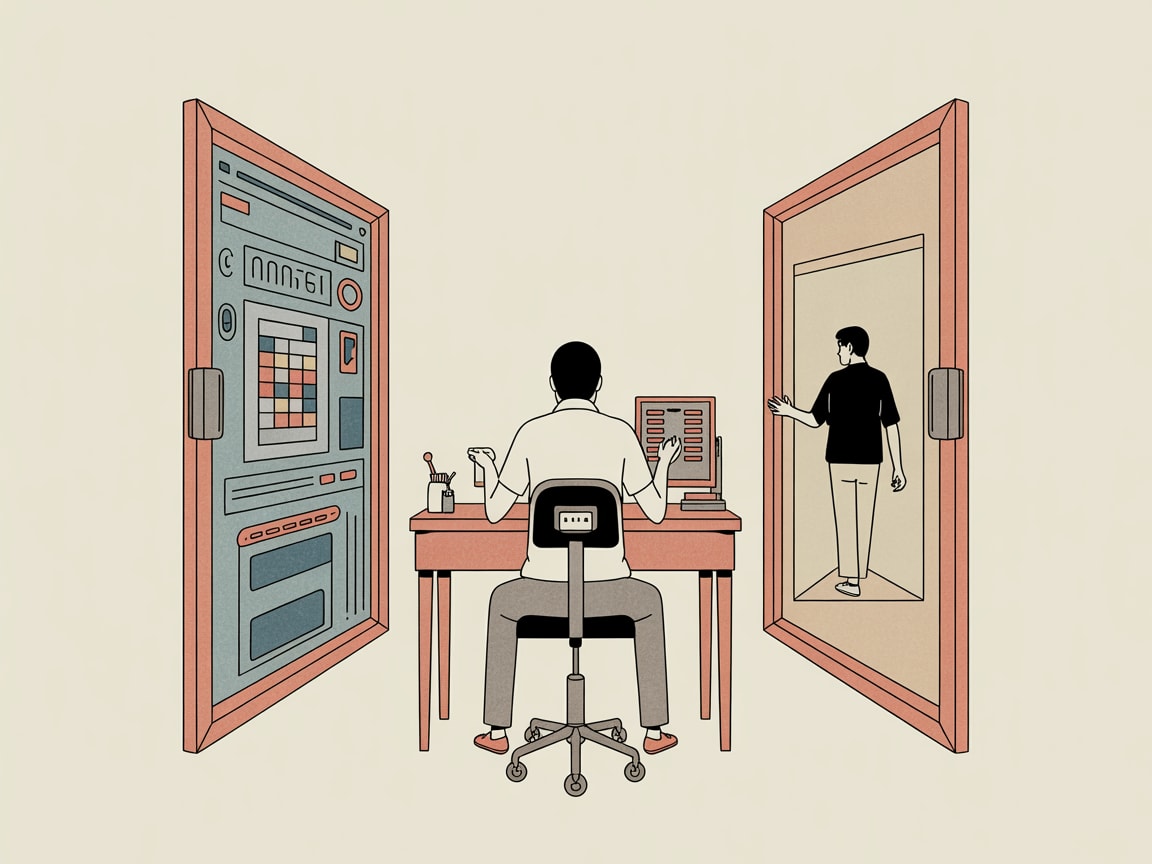
Design Systems as the Bridge Between Precision and Speed
The thread connecting all three of these arguments is systemic thinking. A design system built with accessibility variables, tested interaction patterns, and documented scaling behaviour doesn’t slow teams down — it removes the decisions that were slowing them down in the first place.
The practical build sequence for SEA-facing teams: start with your mobile breakpoints, not desktop, since that’s where your users are. Define typographic scales that accommodate multilingual content from day one. Wire Figma variables to real accessibility thresholds, not aspirational ones. And create a lightweight user testing protocol — even a biweekly 45-minute session — that the team can run without a specialist gating it.
Stakeholder buy-in is usually the last obstacle. The pitch that works: a design system reduces QA cycles, cuts developer rework, and gives brand consistency across every channel — from your TikTok creatives to your in-app onboarding. That’s a resource argument, not a craft argument, and it lands differently in a budget conversation.
Perfect design shipped late to users who can’t read it on their phone isn’t a quality achievement. It’s a well-documented failure mode with a known fix.
Key Takeaways
- Redirect design precision toward decisions that affect conversion and usability — pixel-level perfection on the wrong variables is expensive noise.
- Embed font scaling and accessibility tests into Figma variables now, before multilingual content breaks your layouts at launch.
- Frame user testing internally as loss prevention, not best practice — quantify the cost of shipping untested to make the case stick.
The deeper question worth sitting with: if your design system were a data pipeline, would it pass a basic reliability audit? Are the inputs (accessibility standards, user behaviour data, content variability) actually wired into the system — or are they still manual checks someone remembers to run before a major release? The teams closing that gap are the ones shipping faster and converting better. The ones that aren’t are usually very proud of their Figma files.
At grzzly, we work with SEA growth teams to build the connective tissue between design decisions and the data that should be driving them — from design system architecture to the analytics pipelines that surface what’s actually happening after launch. If your design process feels disconnected from your performance data, that’s a solvable problem. Let’s talk
Sources
- https://smashingmagazine.com/2026/03/testing-font-scaling-accessibility-figma-variables/
- https://uxdesign.cc/the-paradox-of-precision-d172cee23d5a?source=rss----138adf9c44c---4
- https://uxdesign.cc/how-behavioral-science-can-help-persuade-our-team-to-do-one-more-user-test-dbb3ec3729bb?source=rss----138adf9c44c---4

Written by
Chunky GrizzlyDesigning the foundational plumbing — data warehouses, lakehouse models, and ETL pipelines — that separates organisations with genuine intelligence from those drowning in dashboards.