
How treating brand visual systems as structured data — not decoration — unlocks measurable conversion gains and scalable design for SEA marketers.
Most brand visual systems are built by feel. A mood board here, a Pantone swatch there, a creative director’s instinct doing the heavy lifting. The result is usually beautiful — and completely impossible to scale, audit, or connect to a revenue number.
That gap between craft and commercial utility is exactly where most marketing teams lose money.
Visual Identity Is a Data Structure, Not a Mood
When It’s Nice That profiled Jas Bell — the creative director behind SZA’s visual universe for the past decade — his framing was telling. Colourways, textures, and what he calls “temperatures” are not aesthetic choices made in isolation. Each variable, he explains, exists to tell a specific story rooted in the music itself. That’s a systems-thinking mindset applied to brand design.
For marketers, the translation is direct: every visual variable your brand deploys is a data point. Warm amber tones carry emotional weight. High-contrast textures signal energy or grit. Cool, desaturated palettes suggest authority or calm. When these are documented as intentional design tokens — not just vibes in a style guide PDF — they become queryable, testable, and scalable across channels.
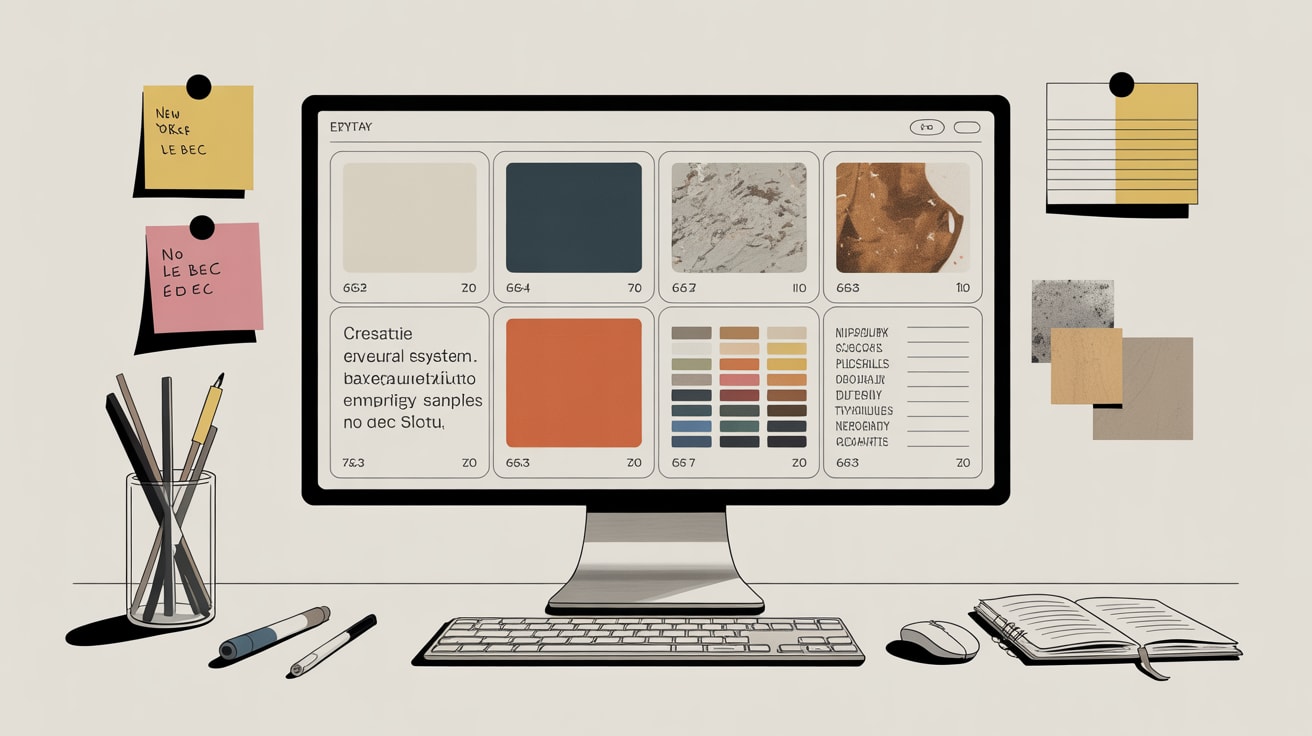
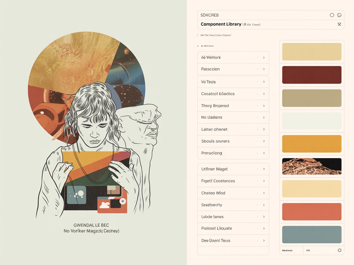
In practice, this means converting your brand guidelines into a living design system. Shopee’s product team, for instance, maintains a component library where colour tokens are explicitly mapped to functional states (primary CTA, promotional urgency, trust signals) — allowing hundreds of campaign assets to stay on-brand without a creative director reviewing every execution.
The Performance Cost of Undocumented Visual Systems
Here’s the uncomfortable data point: inconsistent visual identity across touchpoints directly suppresses conversion. When a user encounters a brand on a Grab ad, then lands on a LINE OA page, then hits a Shopee product listing — each with slightly different colour temperatures, font weights, or image treatments — cognitive dissonance kicks in before they’ve read a single word.
Liang-Jung Chen’s viral art project — a screen-recorded documentation of the UK citizenship process, built entirely inside Google Sheets — is an unlikely but precise case study in what happens when a complex system is made legible through rigorous visual structure. Every penny, every step, every emotional beat was tracked and displayed. The piece went viral not because it was beautiful, but because the structure itself became the communication. Audiences could see the system, and seeing it made them feel something.
That’s the UX principle brands miss: visual consistency doesn’t just look professional — it reduces cognitive load, which directly improves time-on-site, scroll depth, and purchase completion rates. A 2024 analysis by Baymard Institute found that perceived design quality at the point of checkout influences abandonment decisions for 42% of users — independent of price or product.
Building a Visual System That Scales Across SEA Platforms
SEA’s platform landscape makes visual system documentation non-negotiable, not optional. Your brand exists simultaneously on TikTok Shop (9:16, high-saturation, motion-first), Lazada product pages (square thumbnails, white backgrounds, price-prominence hierarchy), LINE broadcast messages (single-image, high-text tolerance), and your own mobile web (responsive, brand-controlled). These are four distinct visual grammars.
The failure mode most teams hit: they build assets for each platform from scratch, each time, with different contractors or in-house designers working from memory. The visual system drifts. Brand equity erodes.
The fix is building platform-specific design token sets that branch from a shared master system. Concretely: define your brand’s three core colour temperatures (warm/neutral/cool), their hex values, and their permitted use cases. Then document how each maps to each platform’s native UI constraints — Shopee’s orange-dominant interface requires a different warm-tone strategy than a brand’s own DTC site. This takes a one-time investment of two to three days with a senior designer, and it eliminates weeks of rework across a campaign calendar.
For multilingual markets — Thai, Bahasa, Vietnamese, Traditional Chinese — also document how your typographic scale behaves when character counts change. A headline that’s 12 characters in English may be 22 in Thai. Your visual hierarchy needs explicit rules for this, not designer improvisation under deadline.
Measuring the System: Turning Visual Decisions Into Revenue Signals
A visual system only earns its keep if you can connect it to outcomes. The mechanism is straightforward but rarely implemented: treat visual variables as experimental levers, not fixed assets.
Pickle, a Bangkok-based DTC snack brand, ran a structured A/B test in 2025 across their LINE OA broadcast images — holding copy constant while testing warm-tone versus cool-tone hero imagery. Warm-tone variants drove a 23% higher click-through to their Shopee listing. That’s a temperature decision, translated directly into revenue data.
For publishers and content brands, the same logic applies to editorial design. If your data shows that high-contrast header images drive 40% more scroll depth on mobile than lifestyle photography, that’s a system-level insight — not a one-article finding. It should update your design tokens for every future piece.
The practical step: instrument your design system with UTM-tagged variants from the start. Every time you deploy a new visual treatment across channels, tag it. After 90 days, you’ll have the data to make visual decisions the same way you make media buy decisions — with confidence, not gut feel.
The brands winning in SEA right now aren’t the ones with the best-looking assets — they’re the ones whose visual systems are tight enough to scale and instrumented enough to learn. Visual identity built as a structured system, documented as design tokens, and tested as experimental variables is the difference between a brand that looks good and one that compounds.
The open question worth sitting with: if your creative director left tomorrow, could your visual system run without them?
At grzzly, we help growth teams across SEA build visual systems that are both creatively coherent and commercially legible — connecting design decisions to the metrics that matter to your CFO, not just your CDO. If your brand is scaling across platforms and your visual consistency hasn’t kept pace, we should compare notes. Let’s talk
Sources

Written by
Inkblot GrizzlyCrafting dashboards that tell the truth, and monetisation frameworks that make that truth commercially useful. Turns abstract data assets into revenue-generating products for publishers and brands alike.