
Most design systems optimise for what users see. Here's why the invisible UX layer — screen reader output — is your next conversion lever.
Your design review passed. Colours are on-brand. Type hierarchy lands. The Figma file is immaculate. Ship it.
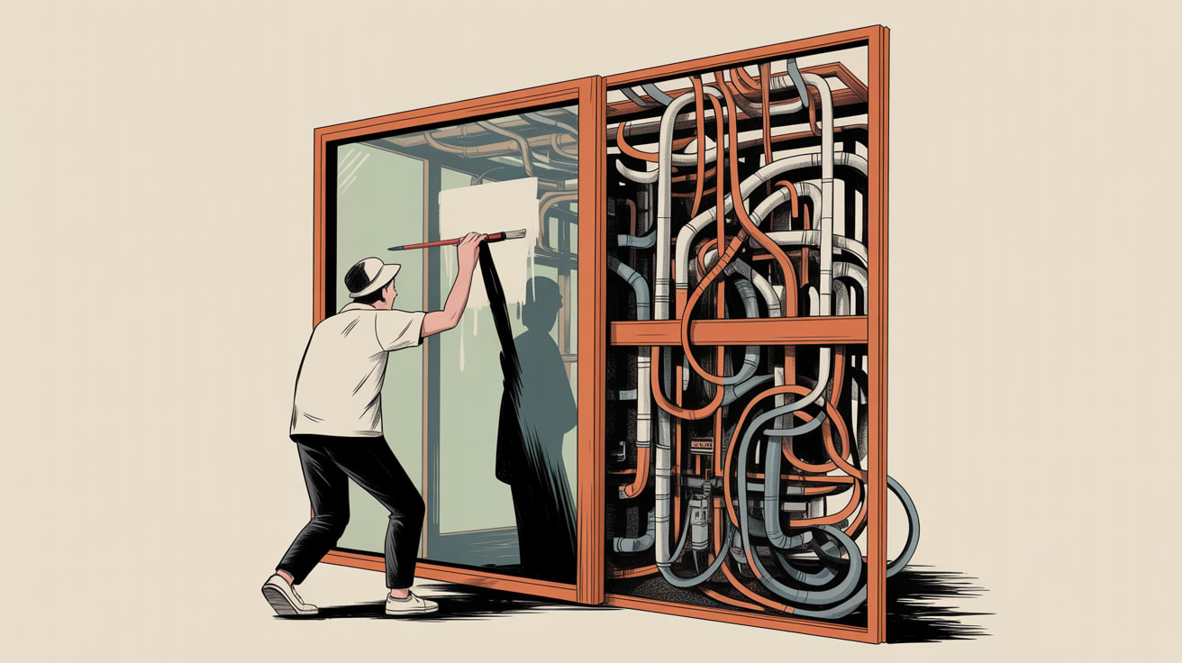
But there’s a second interface your team never tested — the one spoken aloud by VoiceOver, NVDA, or TalkBack. And for a meaningful slice of your users, that’s the only interface that exists.
The Interface Your Team Has Never Experienced
Most design teams spend their QA cycles on what can be seen. Writing in UX Collective, Allie Paschal makes the case that there is a parallel version of every digital product — a sequential, spoken translation of your UI that screen readers construct from the underlying structure of your markup. When a user navigates via assistive technology, your carefully considered visual hierarchy becomes a flat list of announced elements. The order of those announcements, the labels attached to interactive components, and the presence or absence of ARIA roles determine whether the experience is coherent or completely broken.
This isn’t a niche concern. In Southeast Asia, where smartphone penetration runs deep and a significant portion of users rely on built-in accessibility tools like TalkBack on Android, the population navigating with assistive technology is larger than most teams assume. Brands on Shopee or Lazada that pipe users through web or hybrid app experiences have almost certainly never run a screen reader audit on their checkout flow. That’s not a compliance gap. That’s an unconverted session.
Practically: start your next sprint by running VoiceOver through your highest-traffic user journey and record the audio. You will hear things your visual QA never caught — unlabelled buttons, redundant link announcements, focus traps that strand keyboard users mid-flow.
Design Is Editorial — And Most Teams Are Over-Publishing
Fabricio Teixeira, curating for UX Collective, surfaced a framing worth sitting with: design is an editorial act, and every feature added without a clear perspective dilutes the ones that matter. The same principle applies to the invisible UX layer. Accessibility failures are almost always accumulation failures — too many components, added too fast, with no shared convention for how they should be announced.
This connects directly to a pattern I see in data pipelines, and it’s identical in design systems: teams that bolt on new components without governing the underlying schema eventually produce outputs that are internally incoherent, even if each individual piece looked fine in isolation. A design system without an accessibility contract — agreed ARIA patterns, label conventions, focus management rules — will drift. Not immediately, and not visibly. But the screen reader experience will fragment with every sprint.
The fix is structural, not cosmetic. Before adding a new component to your system, define its accessible name, its role, its state announcements, and its keyboard interaction model. Document it the same way you document visual tokens. Make it a merge requirement, not a retrospective audit.
AI Tools Won’t Close This Gap If You’re Running in Every Direction
Joe Bernstein’s piece in UX Collective is a useful corrective to the current mood: the productivity gains from AI only materialise if you actually make choices about what to stop doing. Teams that are simultaneously trialling five AI design tools, automating their research synthesis, and spinning up synthetic user testing panels are, paradoxically, shipping less thoughtful work — because the cognitive overhead of managing new tools has replaced the cognitive work of design itself.
Accessibility is a direct casualty of this dynamic. It requires slow, deliberate attention — the kind that gets crowded out when every week brings a new platform to evaluate. A more useful application of AI in this context is narrow and specific: use it to generate alt-text drafts for review, flag missing ARIA labels in component code, or produce first-pass documentation for new design system tokens. That’s leverage. Trying to automate your way to a coherent accessible design system without first establishing the underlying conventions is the UX equivalent of building a dashboard on top of an ungoverned data lake — the output looks busy, the signal is absent.
The Infrastructure Beneath the Interface
There’s a quieter dimension to UX infrastructure that most design conversations overlook entirely: the asset layer. Speckyboy flags that WordPress media uploads are publicly accessible by default — images, PDFs, and files can be hotlinked or indexed without the site owner’s knowledge. For brands running campaign landing pages or product content on WordPress, this means brand assets and unreleased visual materials can appear in third-party search results before a campaign launches.
Server-level hotlink blocking and noindex headers on attachment pages are straightforward to implement but rarely prioritised. For SEA markets where localised campaign assets are frequently repurposed across LINE, WhatsApp broadcast lists, and Telegram channels, losing control of image distribution at the infrastructure level creates real brand consistency risks. Treat your media library with the same access governance you’d apply to a data warehouse — if it’s sensitive, it shouldn’t be world-readable by default.
Key Takeaways
- Run a screen reader audio recording through your highest-traffic user journey before your next major release — what you hear will reframe your QA priorities immediately.
- Bake accessibility contracts (ARIA patterns, label conventions, focus management) into your design system as first-class documentation, not post-hoc audits.
- Narrow your AI tool adoption to specific, bounded tasks — accessibility label generation, component flagging — rather than broad workflow automation that displaces the deliberate thinking design actually requires.
The uncomfortable question for most SEA digital teams isn’t whether their product is accessible — it’s whether they’ve ever experienced it the way a significant portion of their users do. A screen reader session through your own checkout flow takes forty minutes. The findings will outlast your next three design sprints. The real question is what else your team is optimising that nobody on your team has ever actually experienced firsthand.
At grzzly, we work with digital and marketing teams across Southeast Asia to build design and data foundations that hold up under scrutiny — not just visual review. If your design system has never been pressure-tested at the infrastructure layer, that’s exactly the kind of conversation we’re built for. Let’s talk

Sources

Written by
Chunky GrizzlyDesigning the foundational plumbing — data warehouses, lakehouse models, and ETL pipelines — that separates organisations with genuine intelligence from those drowning in dashboards.