
Why intentional imperfection in UI design drives stronger engagement — and how SEA brands can build human-touch systems that scale commercially.
The most-engaged digital experiences right now share one counterintuitive trait: they feel slightly unfinished. Not broken — just human.
As AI-generated interfaces trend toward frictionless perfection, a measurable engagement gap is opening up between brands that feel algorithmically optimised and those that feel made by someone. For growth teams managing design systems at scale across SEA — where a single campaign might render across Shopee, LINE, a mobile web landing page, and an OOH digital screen — the question isn’t whether to inject humanity into your UI. It’s how to do it without your design system falling apart.
Why Imperfection Has a Business Case
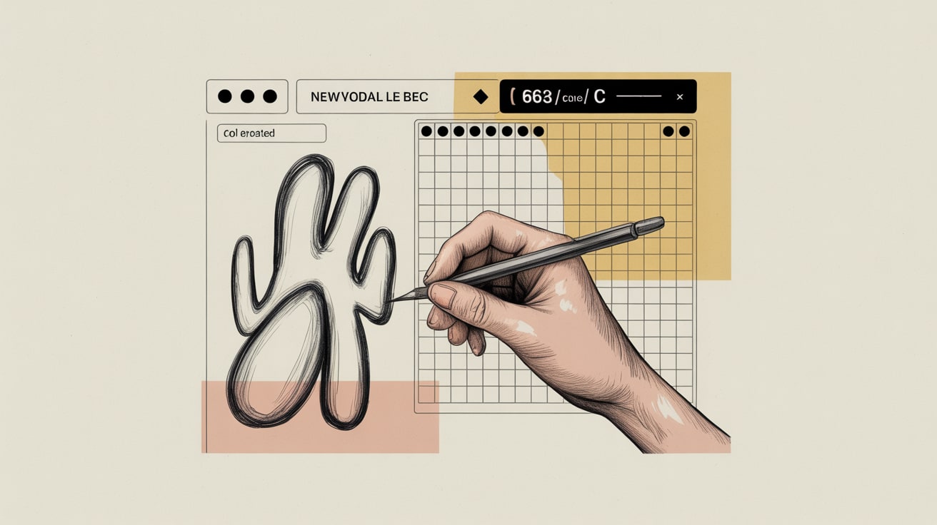
Multidisciplinary animator Daniel Savage, speaking at It’s Nice That’s New York Nicer Tuesdays, made a point that should land hard in any performance marketing meeting: he deliberately uses a pen plotter as a printmaking process to introduce controlled unpredictability into his animations. The result — work commissioned by The New York Times, a published artist book from Vitra editions — isn’t successful despite its handmade irregularities. It’s successful because of them.
The commercial logic translates directly to UI. When every element on a page is pixel-perfect and symmetrical, users’ pattern-recognition systems essentially switch off — there’s nothing to surprise or delight. Micro-imperfections (a slightly organic button shape, a hand-lettered accent font, a layout that breaks the grid once, deliberately) register as signals of human authorship. In conversion rate optimisation literature, this maps to what researchers call processing fluency disruption — a brief moment of engaged attention that, when resolved positively, increases trust and recall.
For SEA markets specifically, where brand trust is often built through perceived personal relationships rather than institutional authority, this matters more than it does in the West.
Tailwind as a Structural Enabler of Intentional Variance
Here’s where the technical and the strategic intersect. CSS-Tricks contributor Zell Liew’s breakdown of Tailwind’s layout capabilities points to something beyond developer convenience: Tailwind’s utility-first approach makes it genuinely faster to implement deliberate layout variation at scale without breaking consistency.
Traditional CSS frameworks push toward uniformity — every card the same, every section the same padding. Tailwind’s composable utilities mean a design system can establish a strict visual language while still allowing controlled deviations: a hero section with an asymmetric image bleed, a testimonial block with a hand-drawn border treatment, a CTA that sits slightly outside the main column grid. These aren’t accidents — they’re intentional tension points that draw the eye.
For SEA teams managing multilingual interfaces (Thai, Bahasa, Vietnamese, Traditional Chinese often coexist in regional campaigns), Tailwind’s responsive and container-query capabilities also reduce the layout-breakage risk that typically comes with longer translated strings. That’s a real operational saving: fewer QA cycles, faster deployment across markets.
Building a Human-Touch Design System That Scales
The failure mode most teams hit is treating human-touch as an art direction decision made once at campaign launch, rather than as a systemic property baked into the design system itself. Savage’s pen plotter work is instructive here — the warmth in his animations isn’t applied at the end. It’s structural, built into the production process.
Practically, this means defining your imperfection parameters upfront. Which elements get organic treatment (illustration accents, typographic texture, photography with visible grain)? Which stay rigidly systematic (grid, spacing scale, colour tokens)? Shopee’s product UI, for instance, maintains tight systematic structure in its commerce layer while allowing seller storefronts considerably more visual personality — a two-tier system that keeps the transactional experience trustworthy while the discovery experience feels alive.
For brands building in-house, the implementation sequence matters: establish your systematic layer in Tailwind or your design system of choice first, then layer in your human-touch components as a defined token set — not as one-off exceptions that junior developers will flatten out in the next sprint.
Budget reality: a human-touch audit and component library extension typically runs 3–5 weeks of senior design and front-end time. The ROI case is easiest to make through A/B testing landing page variants — organic/textured vs. fully polished — where engagement time and scroll depth are the leading indicators before conversion data matures.
The Authenticity Ceiling and How to Avoid Hitting It
There’s a point at which performed imperfection becomes its own kind of corporate artifice — and audiences, particularly the under-35 cohort dominant across SEA’s digital economy, clock it immediately. Artist and photographer Lindsay Perryman’s work, also presented at Nicer Tuesdays New York, is a useful reference point: their photobook Tops derives its visual power from documentation of a real, specific, personal experience. The authenticity isn’t a design choice. It’s the source material.
For brand design teams, this is the harder question: what is your actual human material? Not a stock photo of someone laughing at a salad, not an AI-generated illustration that gestures at warmth. Real founder stories rendered in real founder handwriting. Product photography shot in actual customer environments, grain and all. Community-generated visual assets treated as design elements rather than social media noise.
Grab’s early visual identity in Southeast Asia leaned heavily into this — the motorbike imagery, the street-level photography — before successive rebrand cycles polished it toward something more globally legible but locally less resonant. The lesson isn’t to stay scrappy forever. It’s to know what you’re trading away when you optimise for polish.
Key Takeaways
- Encode your human-touch parameters directly into your design system token layer — not as campaign exceptions, but as a defined visual vocabulary that survives sprint cycles and junior developer handoffs.
- Use Tailwind’s utility-first architecture to implement deliberate layout tension points that disrupt pattern recognition without breaking your systematic grid — particularly valuable across SEA’s multilingual, multi-platform deployment environments.
- Before executing a human-touch visual direction, identify the real human material it should draw from — founder stories, customer environments, community visuals — or risk producing warmth that reads as performance.
The deeper provocation here is a data question as much as a design one: if you instrumented your UI for emotional signal — scroll hesitation, re-reads, sharing behaviour — how much of your current design system would survive the audit? And which of your most ‘optimised’ elements would turn out to be the coldest?
Sources

Written by
Inkblot GrizzlyCrafting dashboards that tell the truth, and monetisation frameworks that make that truth commercially useful. Turns abstract data assets into revenue-generating products for publishers and brands alike.